
Introduction
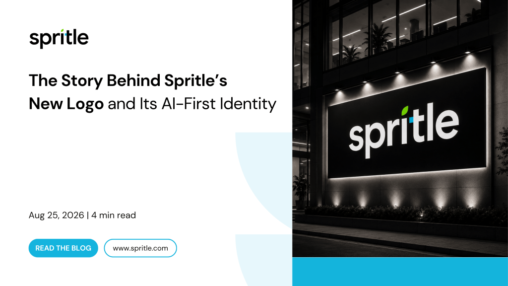
A logo is often the first interaction people have with a brand. It appears on products, websites, presentations, documentation, and every digital experience we create.
As Spritle continues to evolve as an AI-first technology company, we felt it was the right time to create an identity that better reflects who we are today and where we’re heading next.
This wasn’t simply about designing a new logo. It was about creating a visual language that represents innovation, engineering excellence, and continuous growth.
Why We Redesigned
Technology has changed dramatically over the last few years.
Artificial Intelligence is reshaping software development.
Cloud platforms continue to redefine scalability.
Digital products have become more intelligent than ever.
As our services evolved, our identity needed to evolve alongside them.
We wanted our brand to feel:
Modern
Intelligent
Minimal
Confident
Scalable
Instantly recognizable
Image Suggestion
Timeline showing:
Previous Logo → Exploration → Final Logo
The Design Journey
Every great identity begins with exploration.
Before arriving at the final logo, we experimented with multiple concepts, shapes, typography styles, spacing systems, and visual directions.
Each iteration helped us simplify the identity while making it stronger.
Our goal wasn’t to add more.
It was to remove everything unnecessary.
Image Suggestion
Logo sketches
Typography explorations
Grid exploration
Early concepts
Final logo
Meet the New Logo
(Large centered logo)
Simple.
Modern.
Purposeful.
Every element has meaning.
What Each Element Represents
The Wordmark
The bold lowercase wordmark represents confidence without complexity.
Its rounded geometry makes the brand approachable while maintaining a modern technical personality.
It reflects how we build software:
Simple to use.
Powerful underneath.
Image
Highlight only the wordmark.
The Leaf
The green leaf symbolizes growth.
Not just business growth.
It represents:
Learning
Innovation
Sustainability
Continuous improvement
Long-term partnerships
Just as a leaf naturally grows toward light, we believe technology should help businesses move forward.
The leaf is the only place where green appears throughout our visual identity.
That decision was intentional.
It makes growth a memorable part of the logo while keeping the overall brand clean and minimal.
Image
Leaf highlighted with annotation.
The Pixel
The blue square represents the digital world.
Every application.
Every AI model.
Every interface.
Every product.
Everything begins with a single digital building block.
The pixel reflects:
Software Engineering
Artificial Intelligence
Cloud Infrastructure
Data
Digital Transformation
It also connects our visual identity with our primary brand color.
Spritle Blue (#14B4DC
) becomes the foundation across our digital experiences.
Image
Blue pixel enlarged with callouts.
Typography
Great typography creates great experiences.
For our refreshed identity, we chose Google Sans as our primary typeface.
Its clean geometry, modern proportions, and exceptional readability perfectly align with the simplicity and clarity we wanted for the Spritle brand.
We’d also like to extend our appreciation to Google for open-sourcing Google Sans for broader design use. Making high-quality typography more accessible empowers designers and helps create more consistent digital experiences across the industry.
Image
Typography specimen showing:
Google Sans Regular
Google Sans Medium
Google Sans Bold
Brand Colors
Our identity uses a deliberately restrained color system.
Spritle Blue
#14B4DC
Represents:
Technology
Trust
Innovation
Used across:
CTAs
UI
Digital products
Marketing assets
Spritle Green
#7EEC00
Reserved exclusively for the leaf in the logo.
It symbolizes growth and remains a unique visual signature.
We intentionally avoid using green elsewhere to preserve its meaning.
Black & White
Minimal.
Timeless.
Professional.
The neutral palette allows our products and technology to remain the focus.
Image
Color swatches.
Building a Scalable Identity
A logo doesn’t live in isolation.
It appears everywhere.
From business cards to office branding.
From presentations to software interfaces.
The new identity was designed to remain consistent across every touchpoint.
Image Grid
Business Card
Letterhead
Standee
Mug
Glass Door
Outdoor Signage
Mobile App Icon
Website Favicon
Style Guide Highlights
To ensure consistency, we established clear guidelines covering:
Logo usage
Clear space
Minimum sizes
Approved color palette
Typography
Incorrect logo usage
Digital applications
Brand mockups
These guidelines help maintain a unified identity across every platform.
Image
Style guide pages.
Looking Ahead
A new logo marks the beginning of a new chapter.
As Spritle continues building AI-powered solutions, enterprise software, cloud platforms, and digital experiences, our identity will continue to represent the same principles that guide our work:
Innovation.
Engineering excellence.
Growth.
Human-centered technology.
This is more than a logo.
It’s the visual foundation of the next chapter of Spritle.
The post The Story Behind Spritle’s New Logo and Its AI-First Identity appeared first on Spritle software.